Minus is a semester-long experimental packaging and branding project I completed during my junior year as a Communication Design major. The goal was to push beyond traditional graphic design and treat the brand as if it truly existed by producing what their packaging would be.
objective
The brief required two distinct deliverables: a form of product packaging and an experimental piece using a new or unfamiliar medium to us.
strategy
As a regular gym-goer, I often find myself looking for low-sugar pre-workout options that avoid unnecessary marketing fluff. I developed Minus to support athletes through a brand identity that feels blunt, performance-driven, and scientific.
outcome
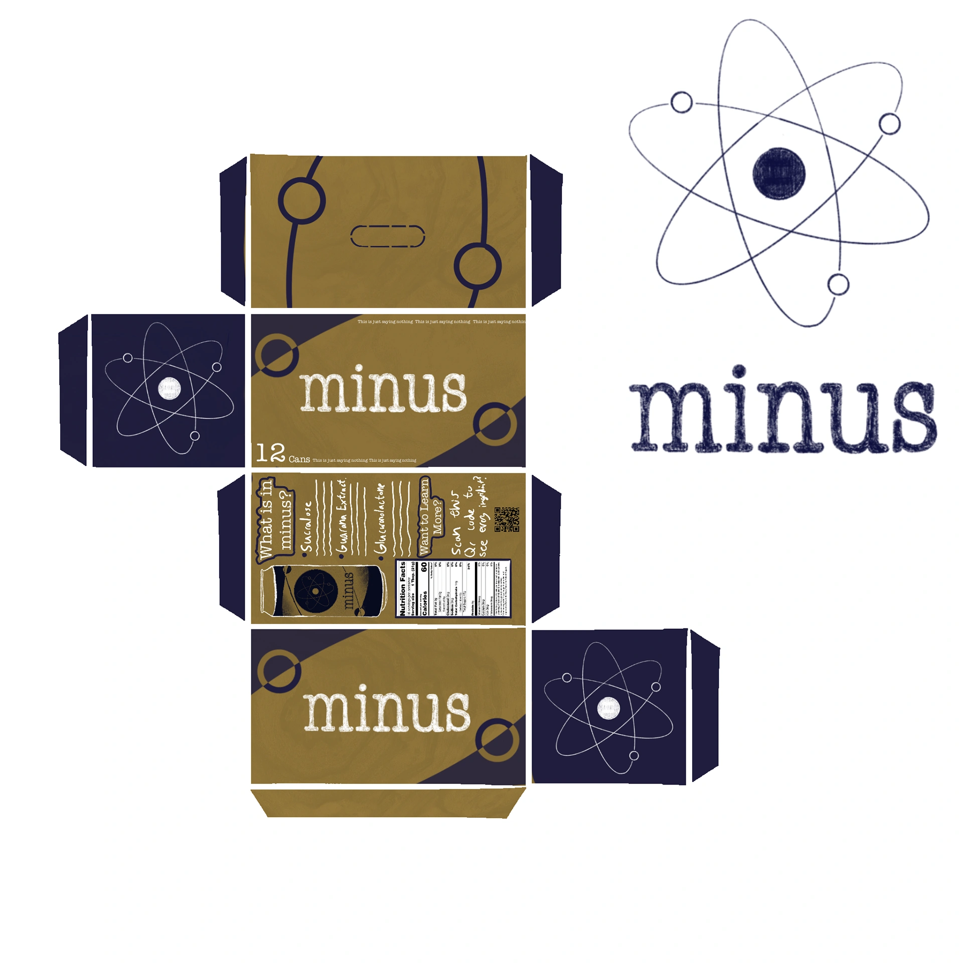
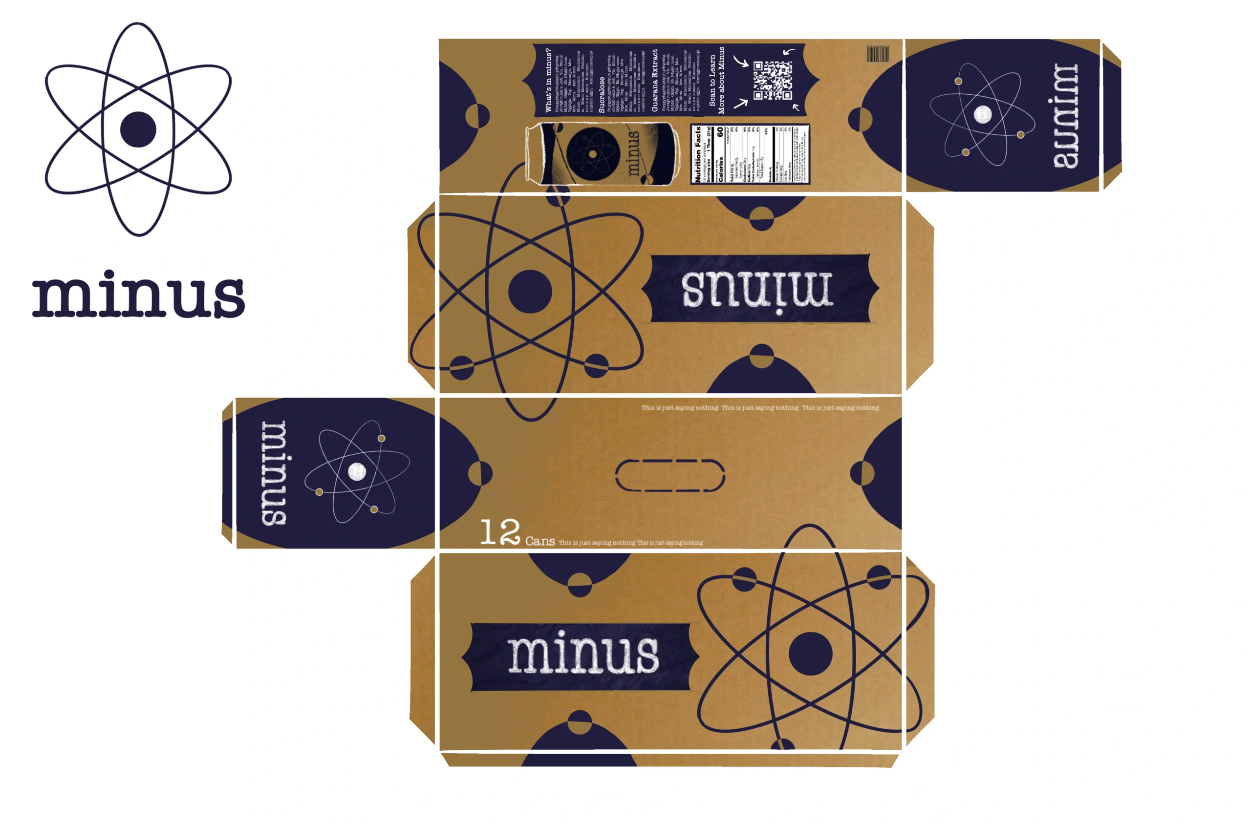
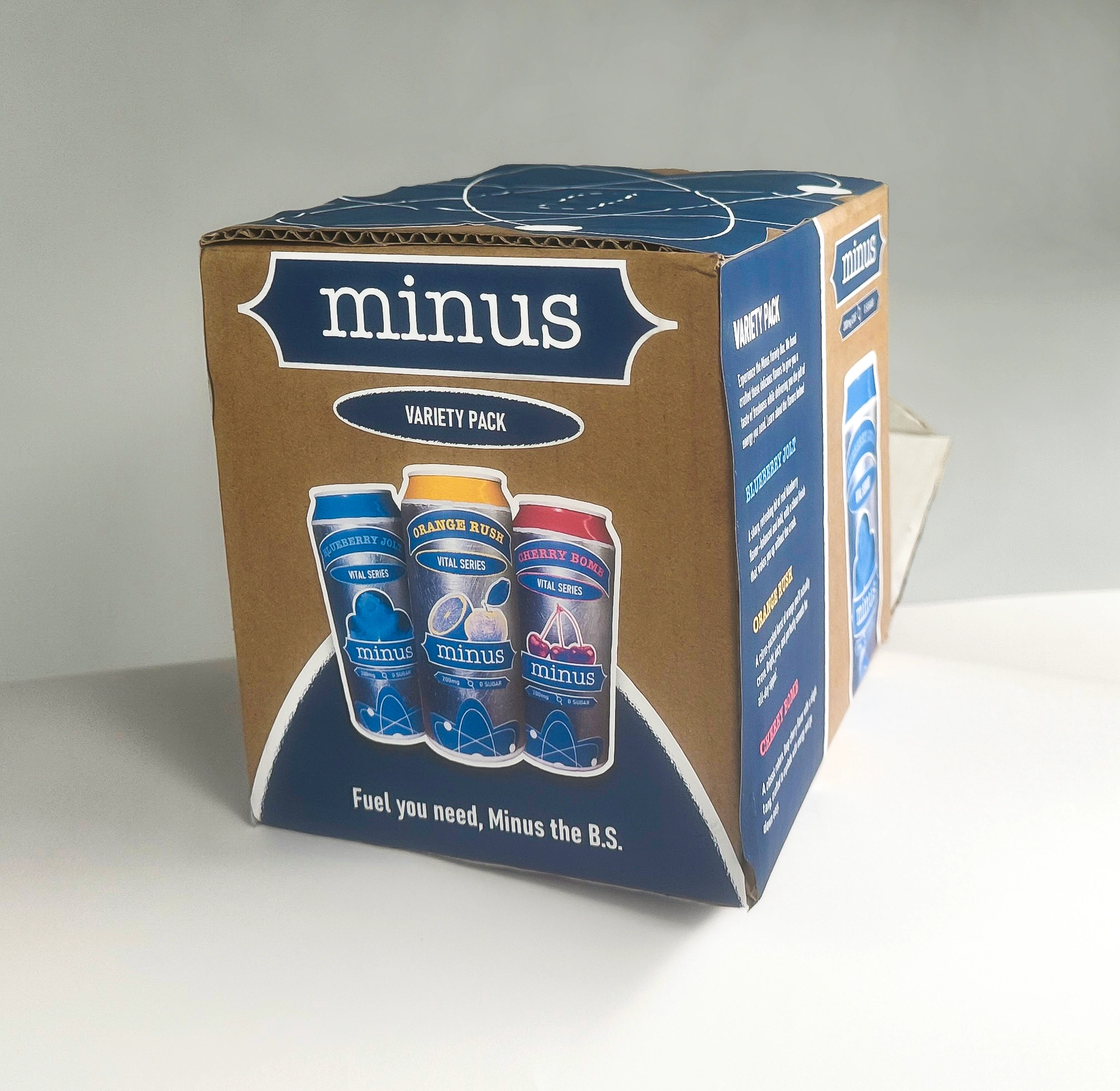
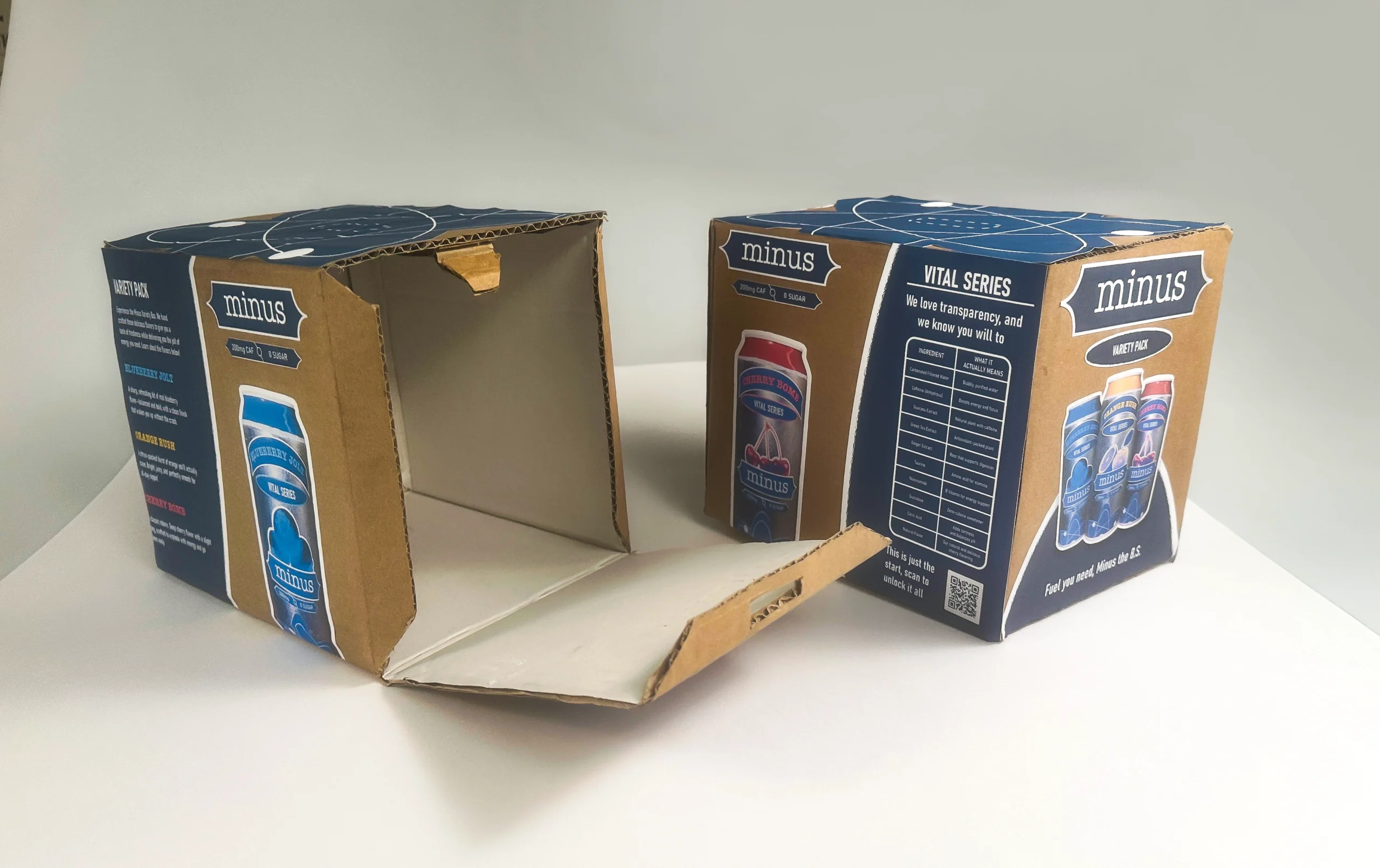
The final system included a logo, three unique can designs, packaging for the cans, and a promotional product trailer created as the experimental component.
Like Wild Chips, another one of my projects, Minus was an experimental project built around exploration and risk.
While the two deliverables did not need to connect, I saw an initiative to combine them into a single, cohesive system. This approach was more ambitious and allowed me to see the brand more wholistically and even make their core product.
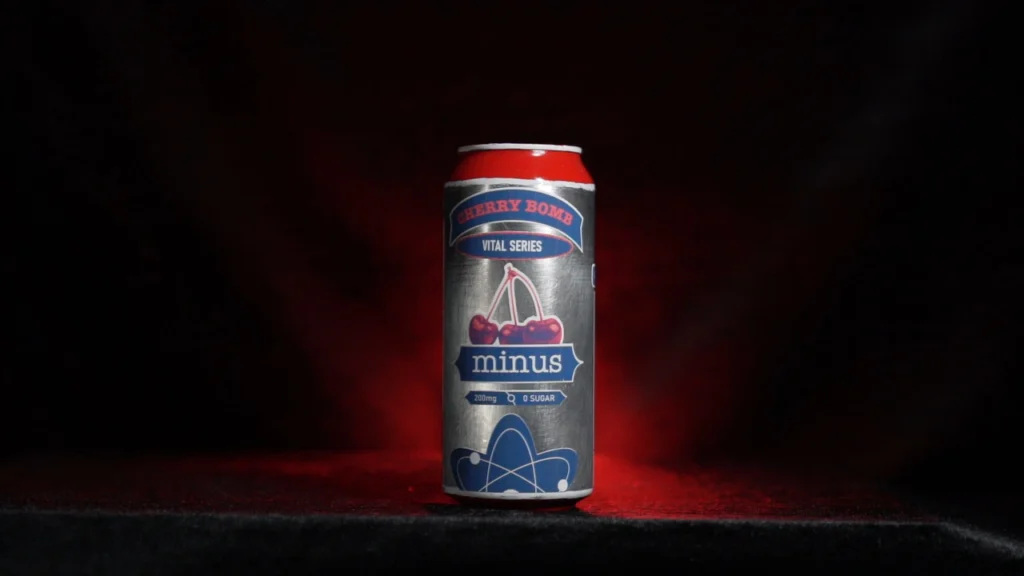
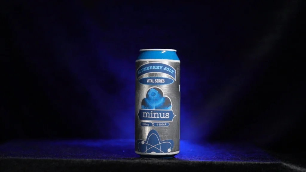
I wanted a visual mark that felt both scientific and aggressive. I chose the electron for the logo because of its negative charge, which serves as a direct reference to the name Minus.
I wanted it to feel simple, but a little rough texture around the edges to fit into typical gym culture. In the end the wordmark became the main visual identity of the brand. Using American Typewriter as the typeface as the letterforms are balanced, feel scientific, and yet organic.
You can also see me begin to envision what the actual can designs would look like.
The brand language leans into deep blues, rough textures, and a rigid, gym-driven aesthetic.
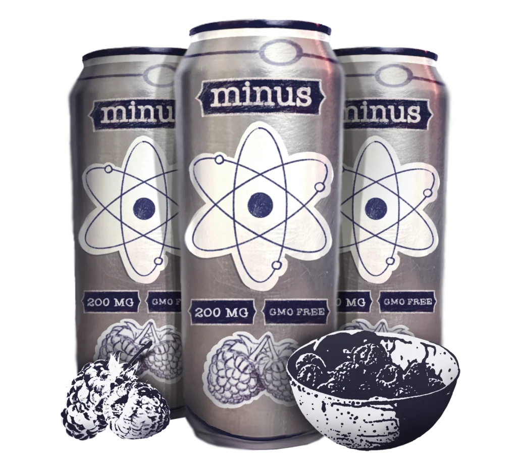
The design process was iterative. I started with a minimal and simplistic style focusing on a sketchy line look. After receiving feedback from my peers, I realized the system was missing the energy of the market. Introducing vibrant accent colors for different flavors completely shifted the brand, making it more readable and energetic without losing its core identity.
Early stage of can design. As you can see the cans felt very sterile and almost like a science experiment. The brand needed color desperately.
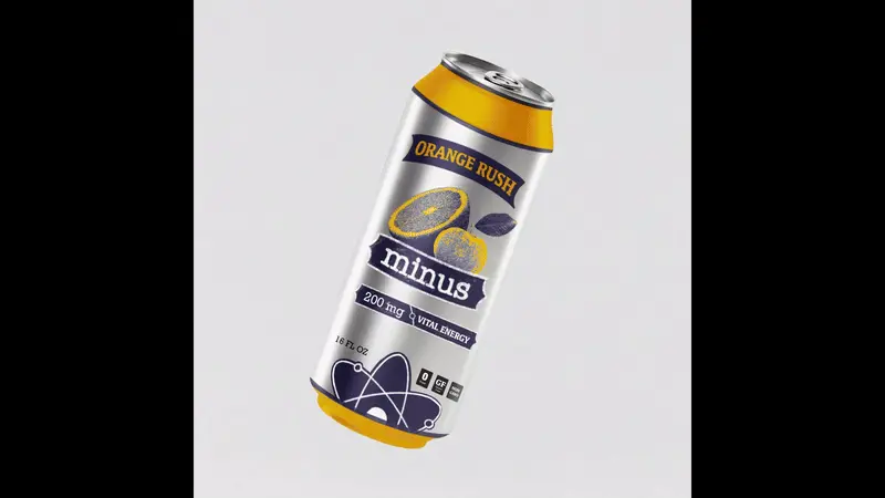
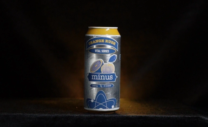
First can design – Orange Rush
Second can design – Cherry Bomb
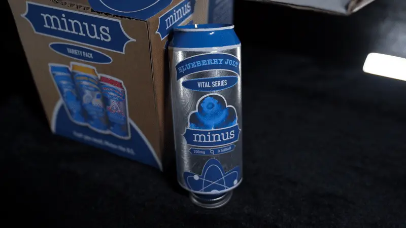
Third can design – Blueberry Jolt
Perfect. Cans are done.
What about the packaging?
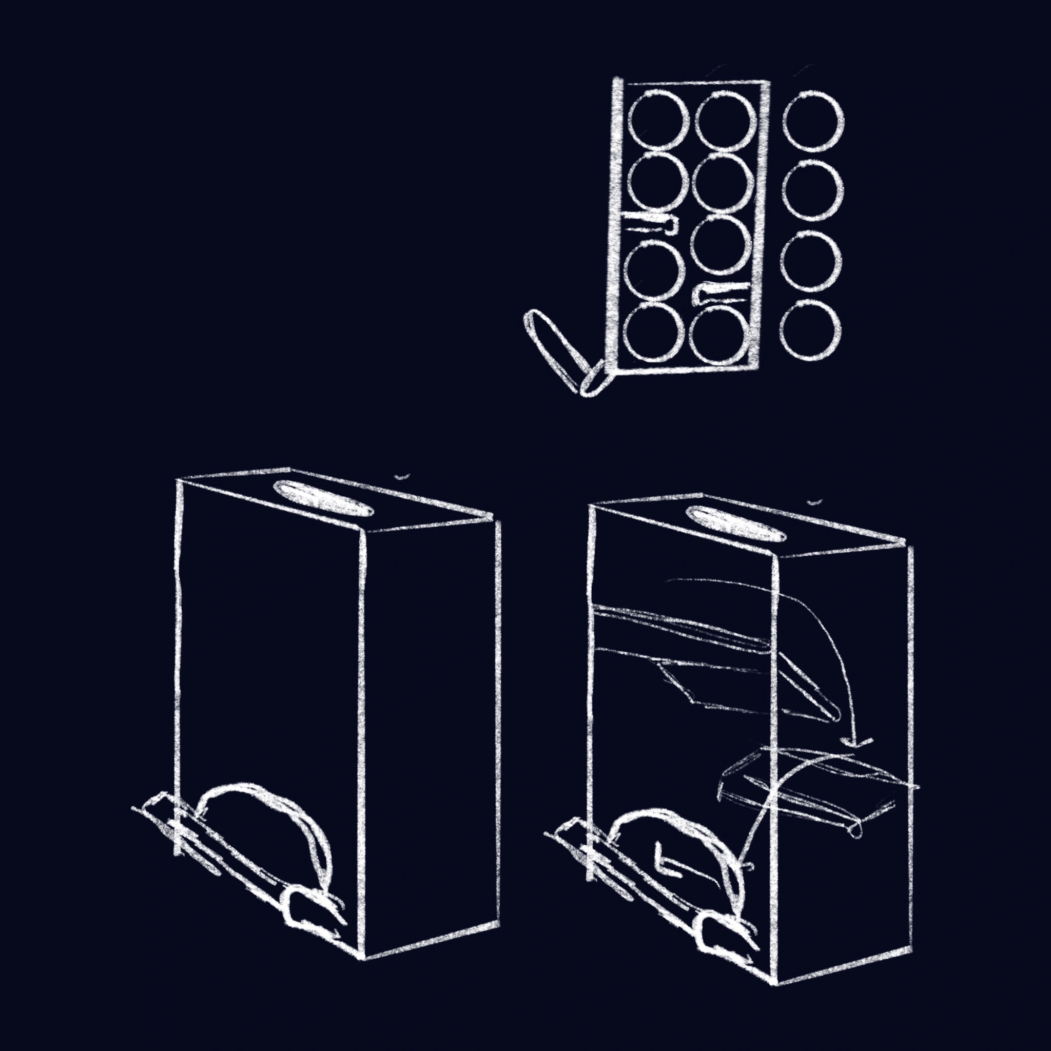
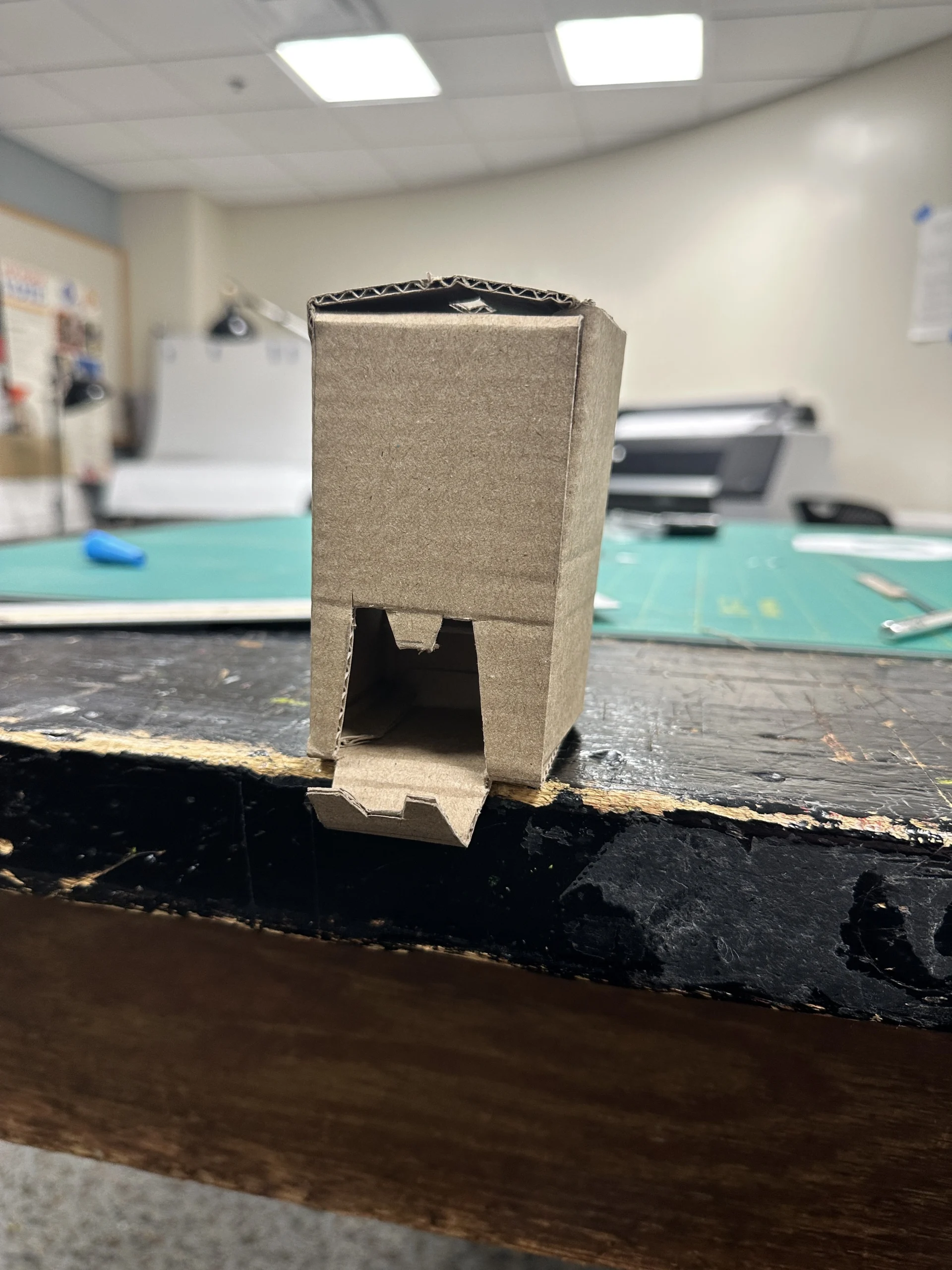
While the brand was starting to come together my packaging had a bigger problem. My initial packaging concept was a self-dispensing twelve-pack box with internal folding tabs. During the prototyping phase, the structure failed because the cardboard could not support the weight of the cans.
Rather than forcing a flawed structure, I redirected my focus toward refining the physical cans and scaling the packaging down to a six-pack.
Finally I had to produce the promo video. This was a significant learning curve that required me to learn Adobe Premiere Pro and After Effects at a much higher level. I worked in a studio environment with professional lighting and equipment with a media producer.
If you want to learn more about the video please explore the motion design section of the project via the button below!
Minus remains one of my favorite projects from my time at Miami University. It required me to balance branding, product development, packaging, and motion design into a single ecosystem. Treating the brand as a real entity shaped how I approach large-scale design work today and represents the standard I aim for as I grow.
-04")