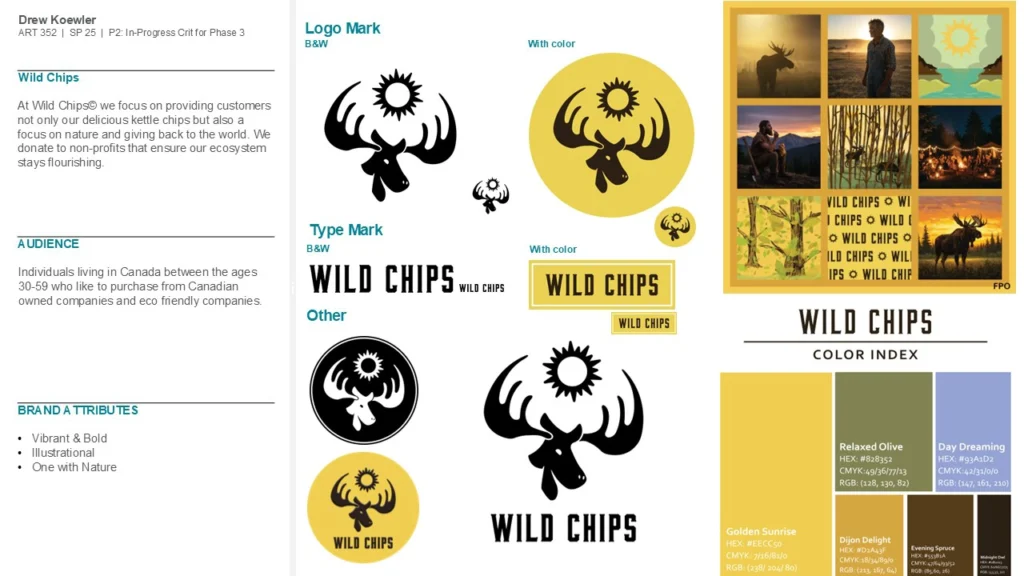
This is Wild Chips, an academic branding project completed during my junior year as a Communication Design major. I developed a food and beverage brand to explore brand systems, packaging, and strategic storytelling within a consumer market.
objective
To design a complete brand within any industry, centered around an animal of my choice and supported by a full set of brand guidelines.
strategy
I selected a moose to represent a gentle-giant personality, since I relate to that. From there, I built the brand around market positioning and developed a strategic plan for how it would compete, exist, and scale within a real-world market.
outcome
The project resulted in a comprehensive brand guidelines system, multiple brand applications including the core product, and a strong foundation in brand exploration and positioning.
For this project to succeed, strategy needed to be embedded from the start.
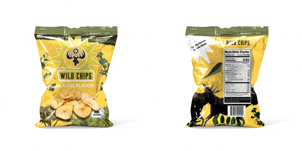
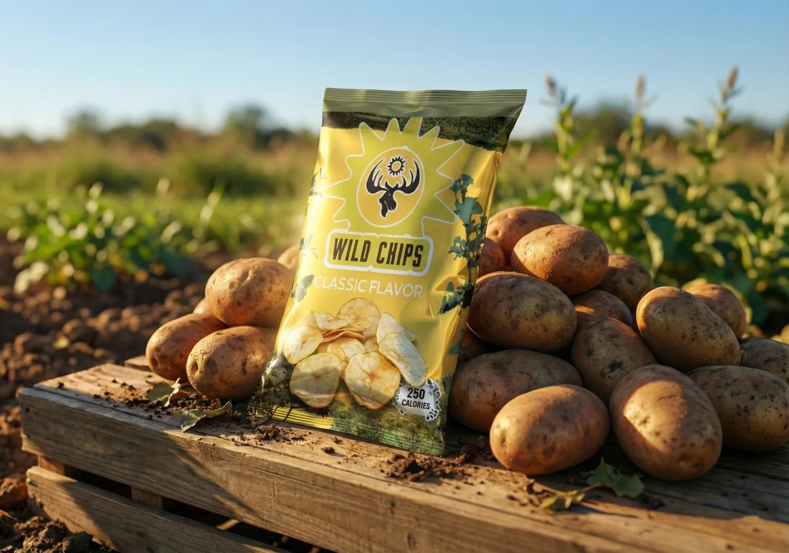
I envisioned the brand as a Canadian classic, supported by the country’s strong potato farming industry, the moose as a national symbol, and a political climate that encouraged buying local over American alternatives.
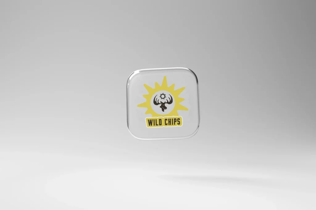
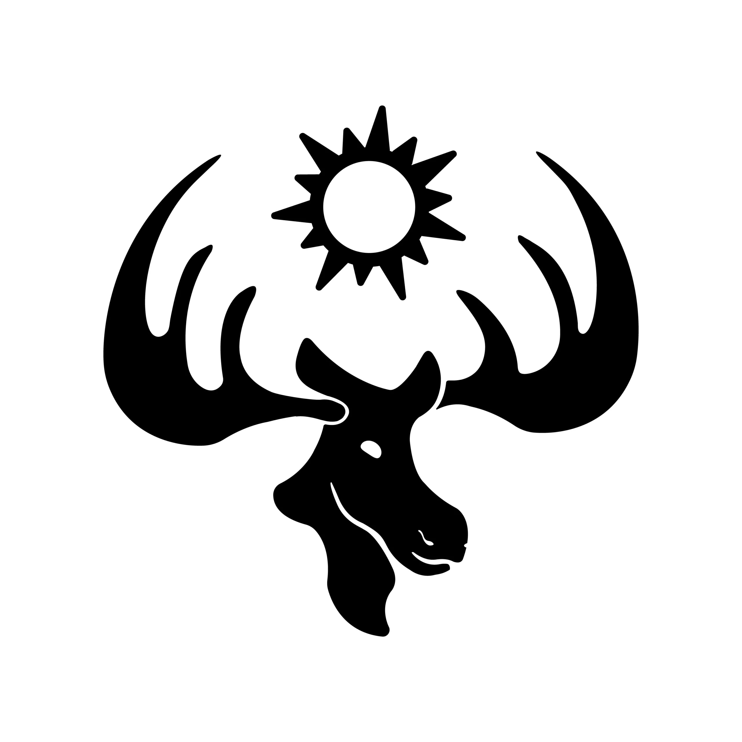
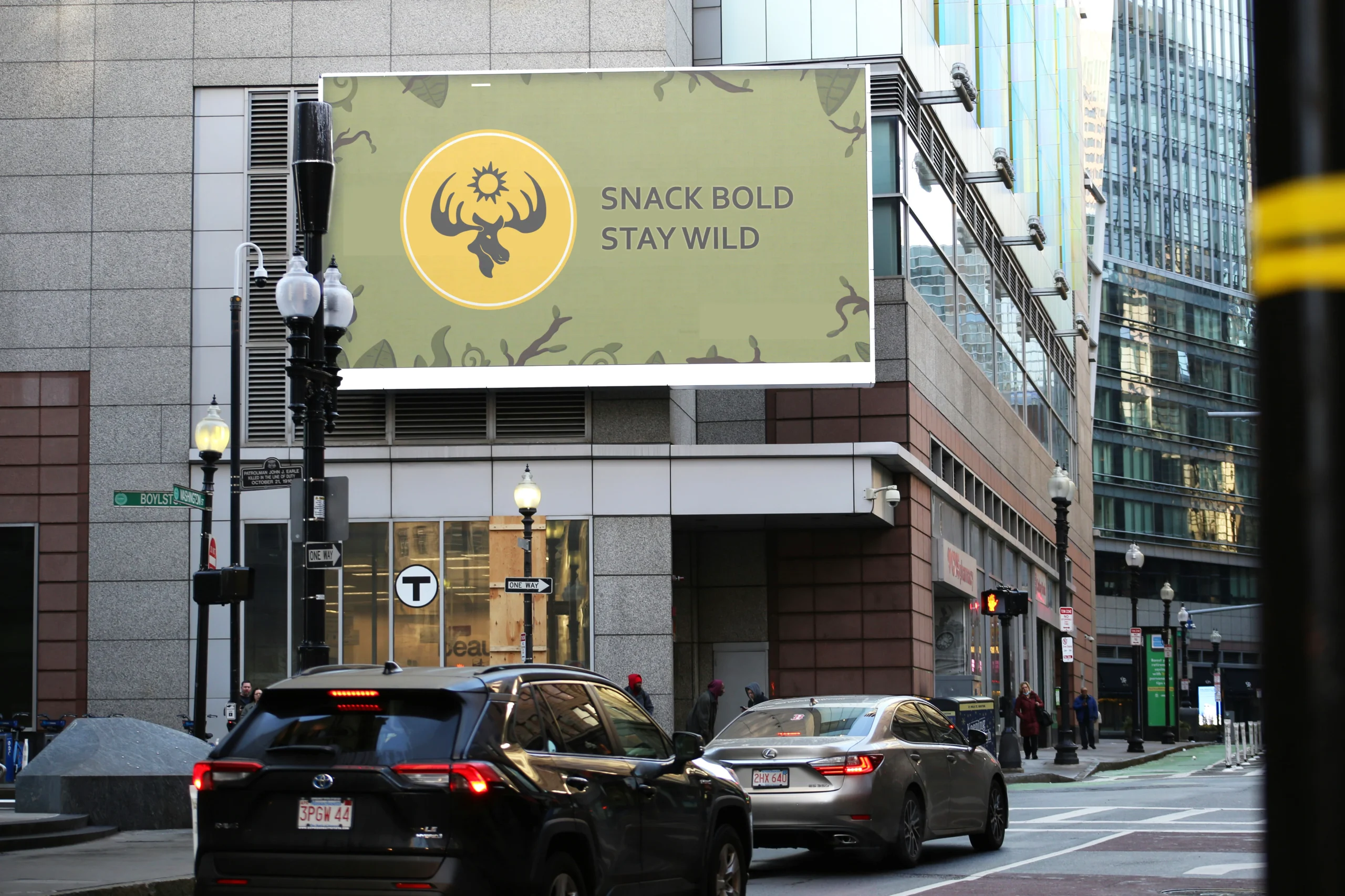
From the outset, the goal was to create a striking, recognizable logo.
I leaned into the contrast between the moose’s soft head and sharp antlers, and introduced the sun as a recurring industry motif to visually connect the antlers with the brand’s broader chip category.
I wanted the color palette to feel warm and inviting, reflecting the outdoors and the rays of the sun.
For typography, I chose the Bourbon typeface, which features bold, display-style letterforms with a sense of vintage craftsmanship that leans into an outdoorsy, hand-built feel. Together, the colors and type helped the brand feel refreshing and rooted in an authentic, outdoor-inspired identity.
Earlier stage where as a class we reviewed our logos, color schemes, and wordmarks.
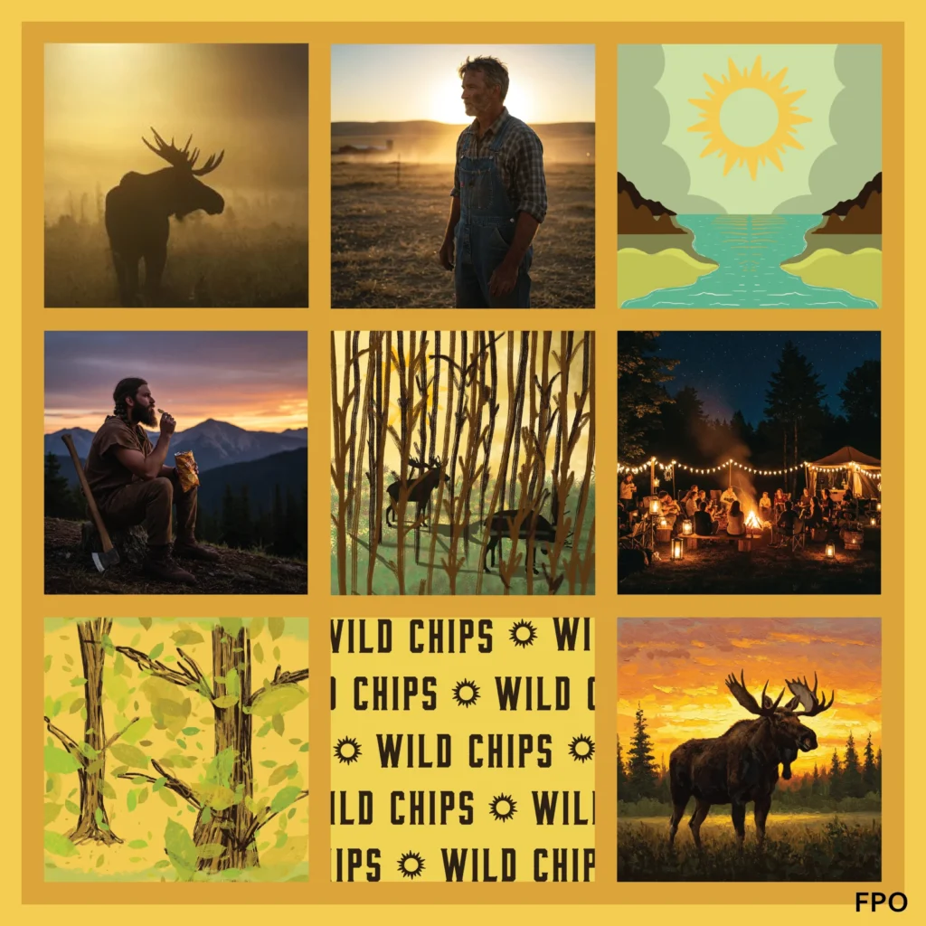
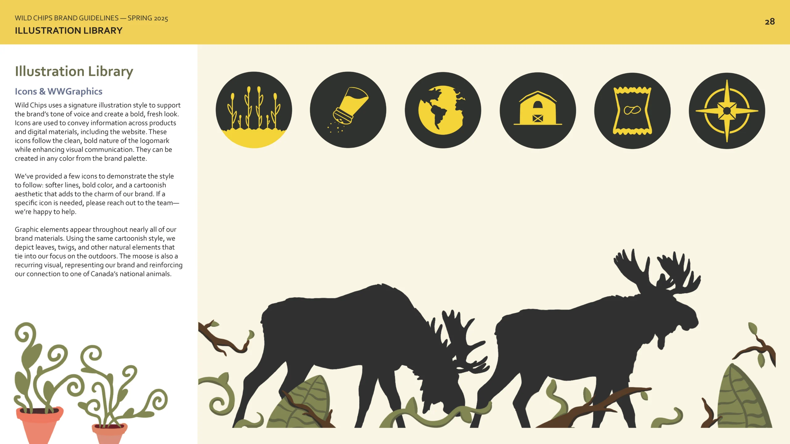
Created to help get understand the visual identity of Wild Chips.
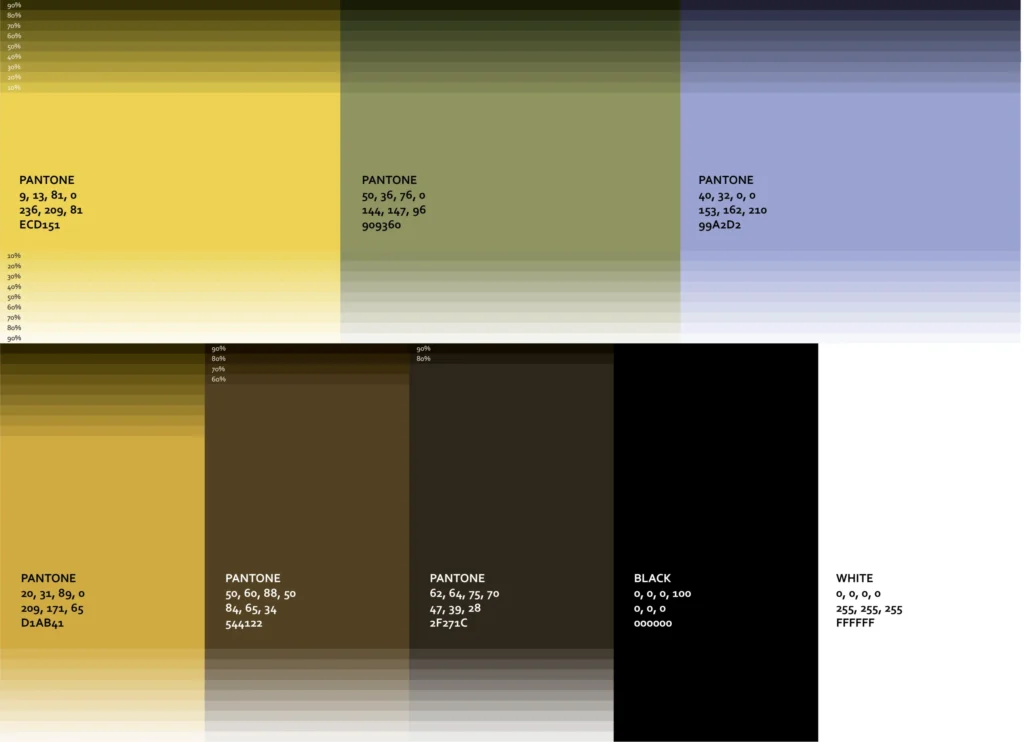
Final color scheme. I focused on a analogous color scheme centering around warmth and natural colors.
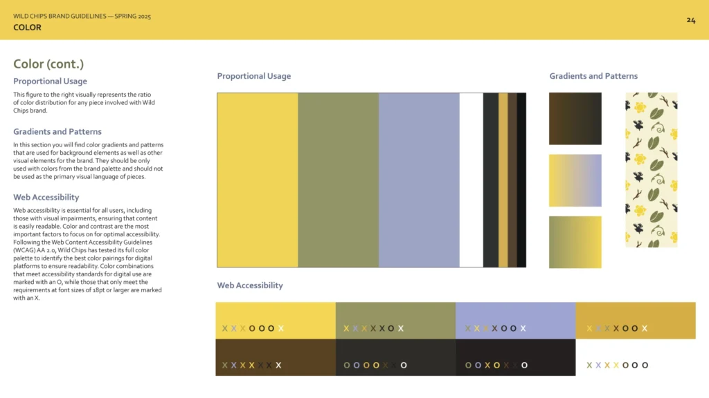
Proportional color usage and web accessibility for brand colors.
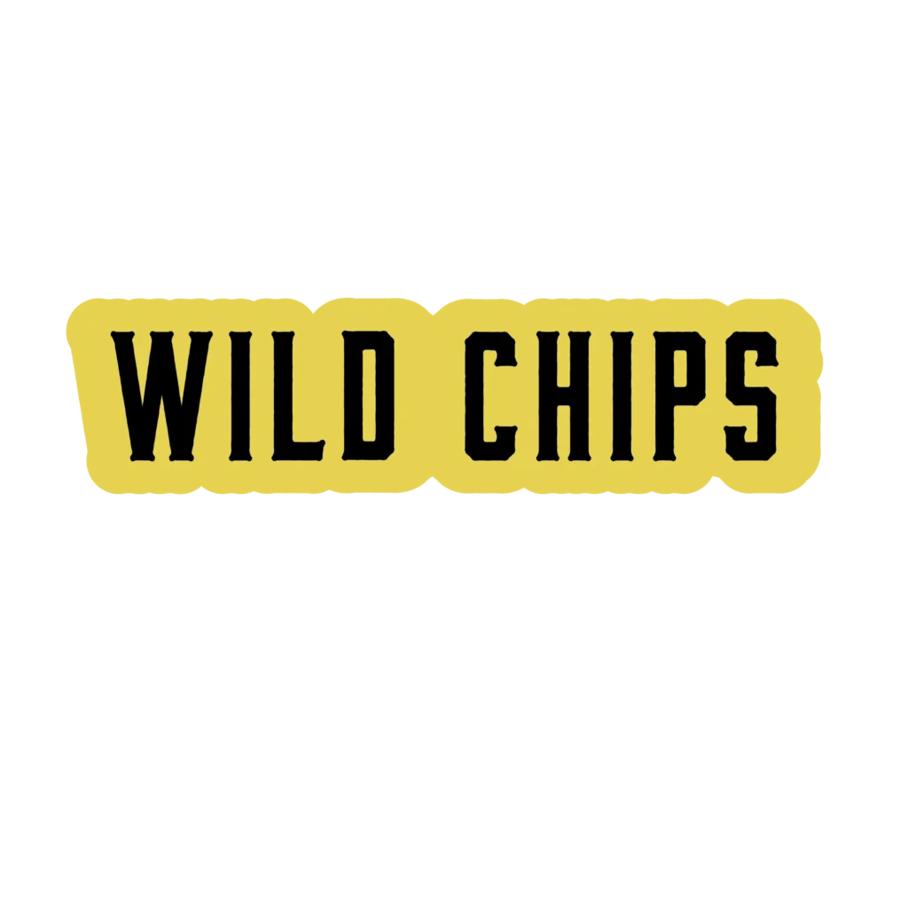
Final wordmark in color, featuring Bourbon typeface and Wild Chips brand colors.
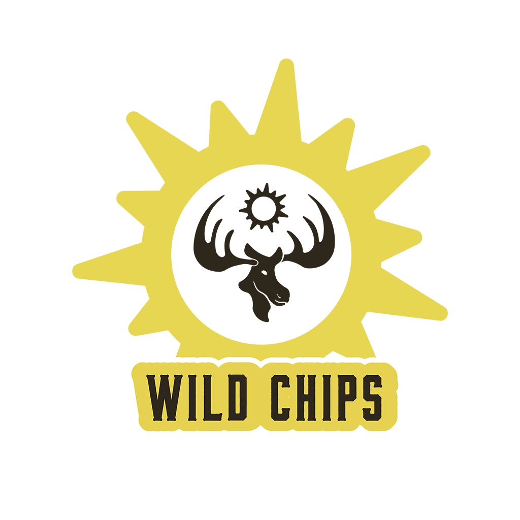
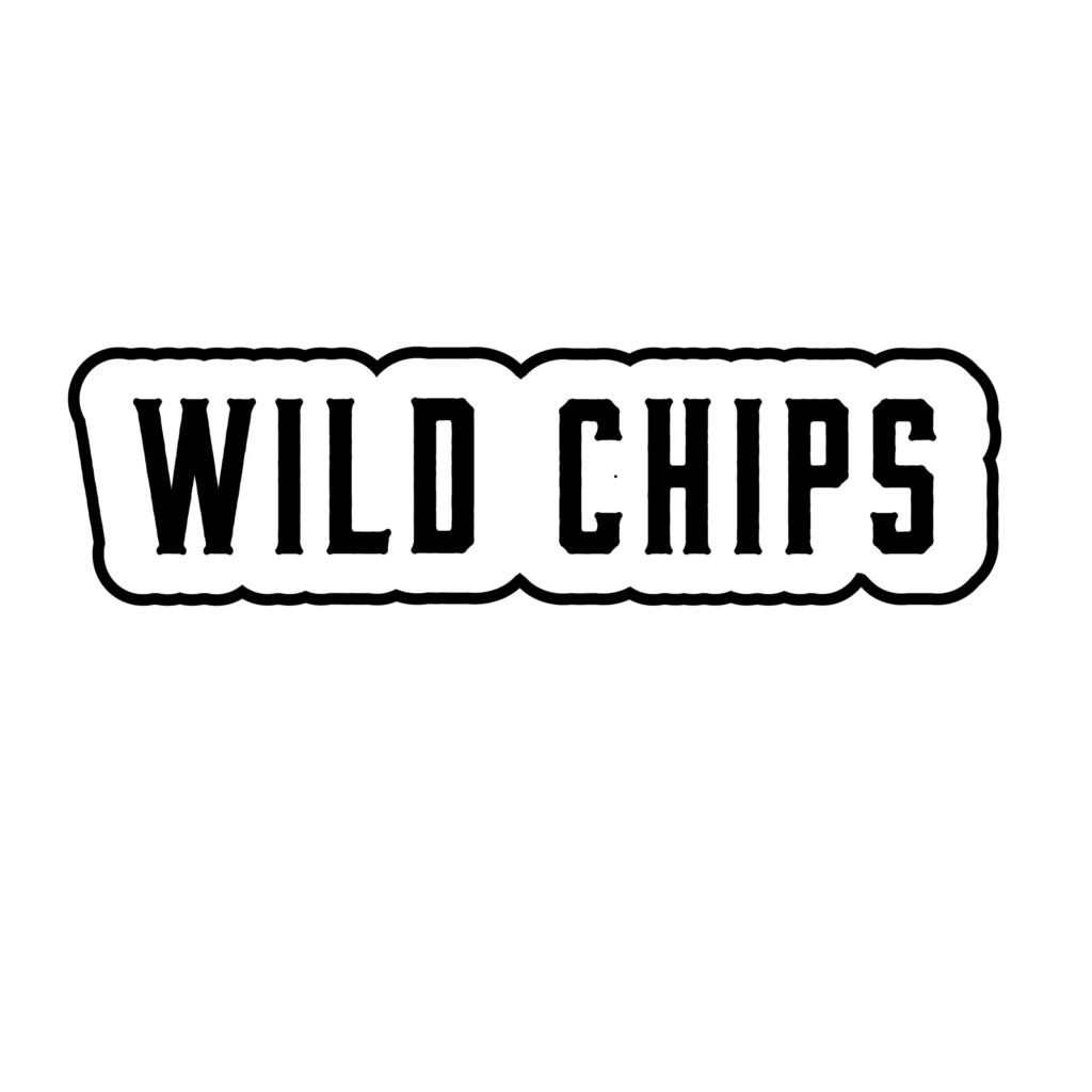
Final wordmark in black & white with carrier.
but there was a
problem
solution
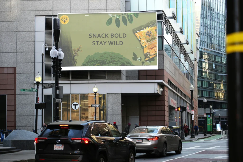
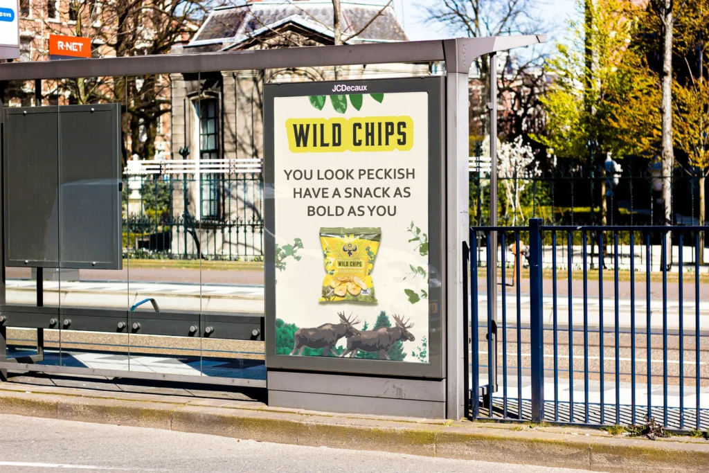
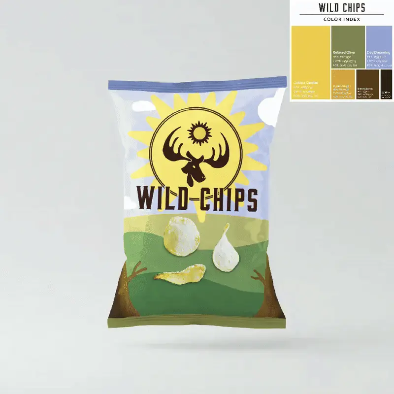
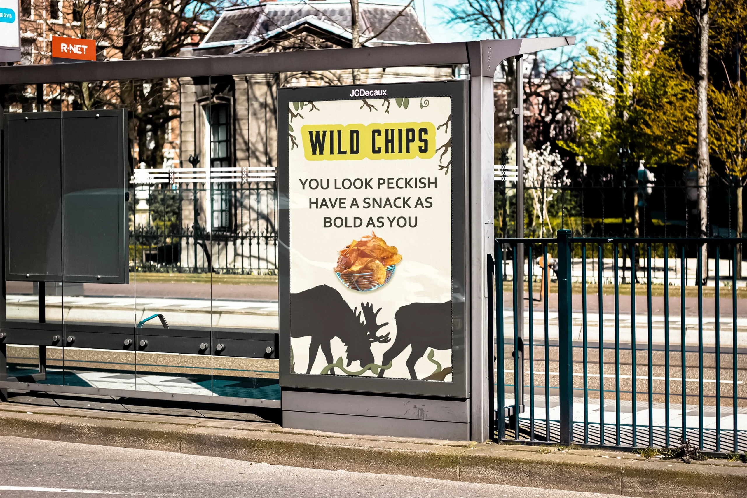
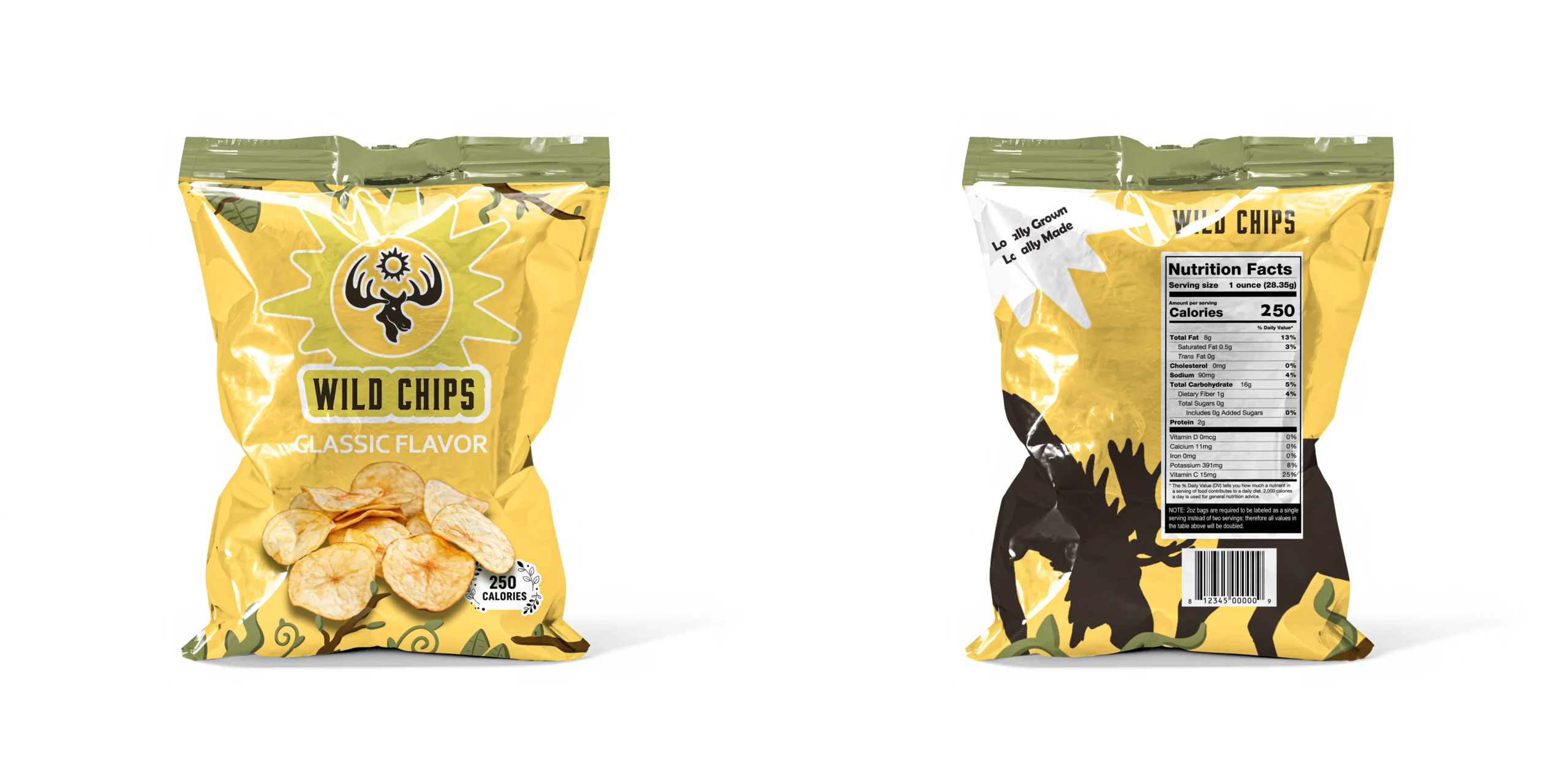
When it came to brand applications, I ran into a challenge. I had settled on a simpler graphic style, but after receiving feedback and reviewing the brand as a whole, I realized the designs felt too childish and simplistic.
I refined the graphic style by moving toward photorealistic imagery. Through image editing and texture work, I developed a look that blended flat color with realistic photography. Once applied across the rest of the brand, the visual direction finally felt right.
Earlier stage where as a class we reviewed our logos, color schemes, and wordmarks.
Final color scheme. I focused on a analogous color scheme centering around warmth and natural colors.
Proportional color usage and web accessibility for brand colors.
Final wordmark in color, featuring Bourbon typeface and Wild Chips brand colors.
Final wordmark in black & white with carrier.
From an early brief
to a complete brand
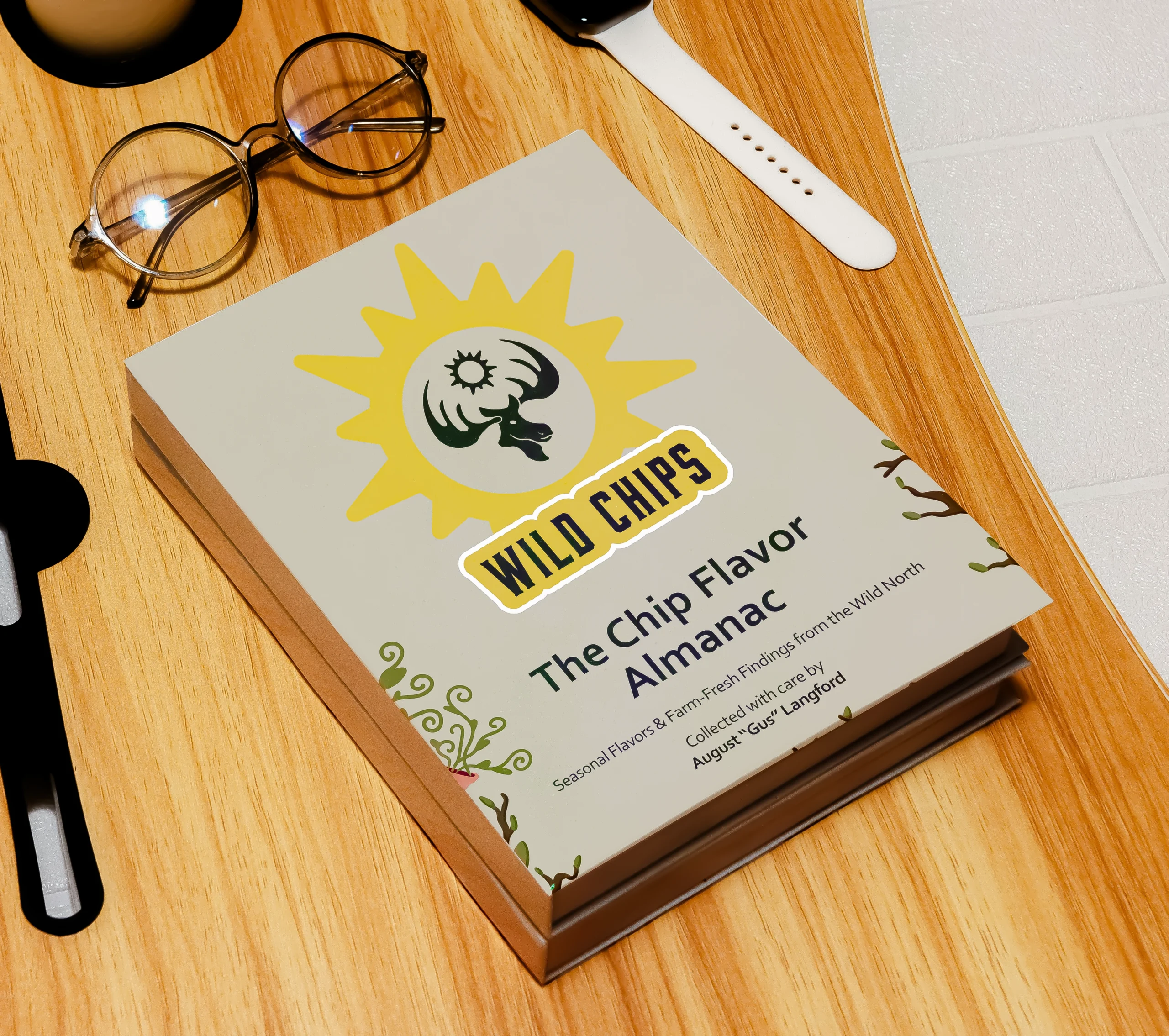
By the end of the project, Wild Chips had developed into a complete and cohesive brand system. The final brand guidelines defined how the brand presents itself visually and verbally, and how it adapts across different applications. This project reinforced the importance of consistency and intention when building a brand from the ground up.
If you would like to explore the full brand guidelines, they are available below.
-04")