Welcome to
Grove
Grove was my senior capstone project for my Communication Design degree at Miami University. This project spans branding and digital product design. Over the course of the semester, I developed a set of brand guidelines, physical apparel, an interactive website and mobile app, an animated promotional video, and exhibition materials.

objective
Build a realistic, multi-touchpoint brand for our exhibition, combining physical and digital to create an immersive brand experience.
strategy
Establish the visual and verbal identity through brand guidelines first, ensuring a consistent foundation before making the digital and physical products.
outcome
Successfully launched Grove at the exhibition, presenting a ecosystem of digital prototypes and physical apparel that directly challenged industry norms.
I began with the company name, Grove. The ideation process started with understanding the target audience: young lifters who want creative and fun activewear, to stand out with fun graphics, while still feeling part of a lifting community. On the right, you can see me sketching possible concepts for the logo.
The Messaging Framework was foundation for the entire verbal identity of Grove. Here you can see the key messages the Grove aimed at delivering as well as our main truth.
Finalized logomark with secondary versions. You can see the sketches of the logo being drawn earlier. In the end I used a modified version of RL Aqva Black, softening the letter forms for a more organic look.
Logomark rules and visual mockups.
The graphics slide, one of the most important aspects of our brand. Here I showed mockups of graphics I made to help give designers the feeling we want to convey.
The visual system evolved alongside the strategy. Early designs relied on standard athletic typography, but it felt too corporate. To match Grove’s new confident, lighthearted voice, I shifted the visual direction to saturated colors and custom, satirical illustrations of animals lifting. On the left here you can see a few pages from the brand guidelines.
For the motion assets, I animated these illustrations in After Effects using a playful, retro style to cement the brand’s personality in the promotional video.
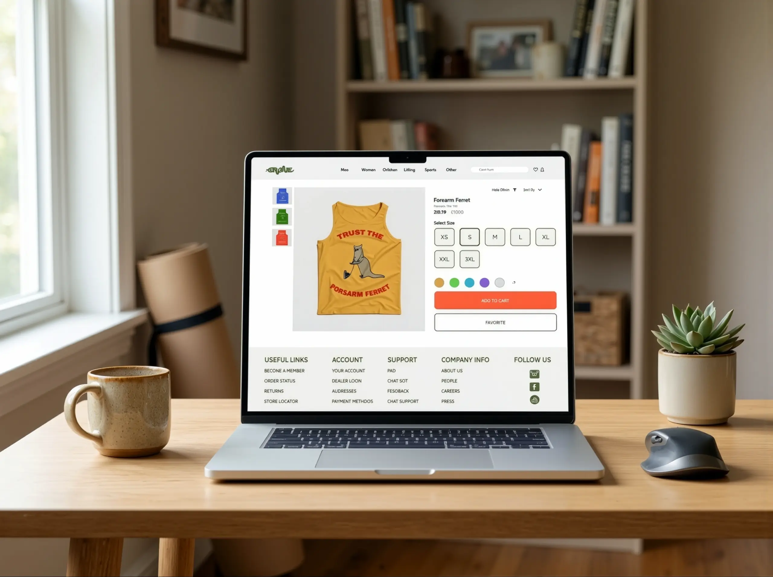
The creation of Grove involved parallel tracks for physical and digital products. On the digital side, I built wireframes and high-fidelity prototypes in Figma for a desktop website and mobile app, allowing users to browse products, filter by color, and select sizes. This would allow users to click around the website and app as if they were real.
Physically, I created a prototype line consisting of a tank top and sweatpants, applying the graphics via heat-transfer vinyl.
Mockup of Product Screen for App.
Mockup for Product screen for web.
App & Website Visual Click Through
Picture of the software used in printing on physical products.
WIP picture of GYM RAT sweatpants.
Final sweatpants and tanktop.
To launch the brand, I built a promotional video as Grove’s main hook. I chose a retro style with a jitter effect to contrast with the ultra-polished look common in fitness advertising. The video relies on quick cuts showcasing the physical clothing line alongside the animated animal graphics. This approach clearly communicates the brand’s personality, showing how the playful visual identity translates into a real-world product line.
a lifters dream to a lifters reality
Grove debuted on May 1st, 2026, at our senior exhibition, Reflections, in Cincinnati’s Over-the-Rhine district. The opening night drew a large crowd of designers, artists, alumni, and family. I had the honor of giving an introductory speech for the event. Seeing people interact with the apparel and click through the digital mockups proved that the whimsical tone resonated with lifters. Ultimately, this project taught me about product design, branding, and staying connected to why I became a designer.