For my senior capstone project in Communication Design, we partnered directly with medical robotics company named Distalmotion. I served as the Creative Director for an eight-person team of designers and marketers, leading the group through a fast-paced corporate competition to pitch a brand identity and market entry plan for their soft-tissue microsurgery system, Dexter.
objective
Complete market and creative research to build a defensible U.S. market entry strategy, a rebuilt brand identity, a finalized logo, and five distinct digital tactics for a final corporate pitch.
strategy
Shift the core commercial focus away from hospital purchasing boards and directly onto the individual physicians, linking our creative identity to practitioner psychology to justify our entry plan.
outcome
Shipped a complete visual brand system, a custom logo reveal animation, and five high-fidelity tactical mockups that earned direct praise from Distalmotion CEO Greg Roche.
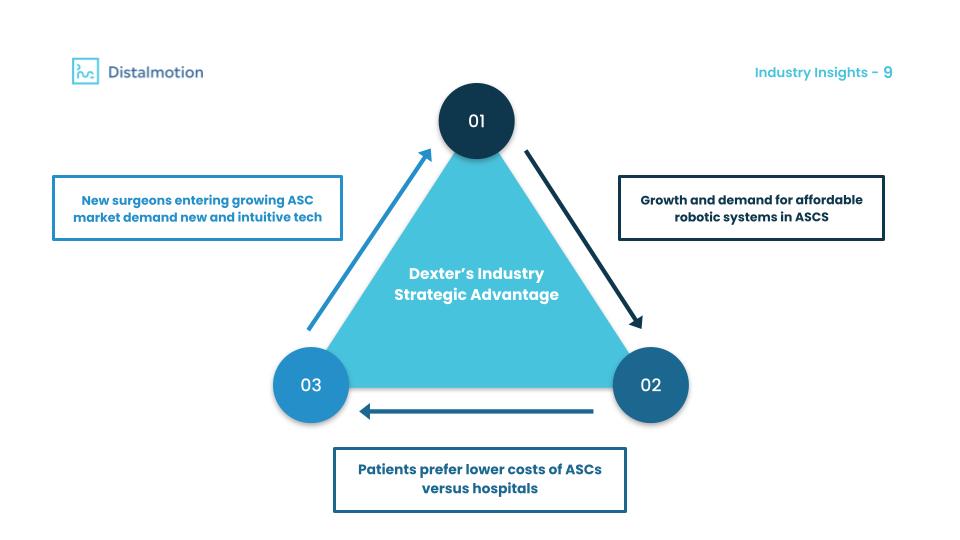
The project launched with full market analysis and brand research. I operated under a strict nondisclosure agreement that limits the specific target market data I can share, the crucial takeaway is that our final strategy focused entirely on individual physicians owners.
We built our foundation by using public records to run a breakdown of Ambulatory Surgery Center (ASC) ownership. Analyzing how operational needs shifted between physician-owned and corporate facilities gave us the baseline data required to build our argument.
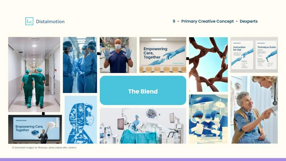
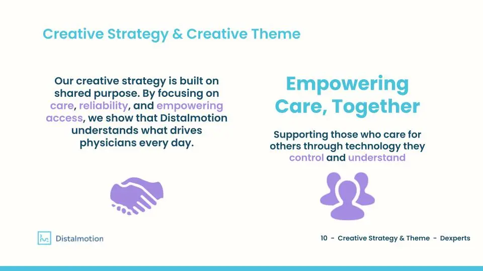
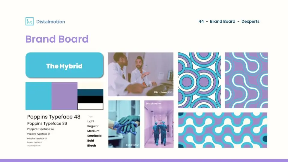
Our creative strategy focused on the shared purpose between Distalmotion and physicians, centering the brand message on supporting the doctors who deliver care. This focus on passion and integrity directly informed our palette.
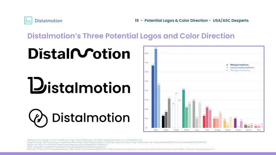
Design psychology showed us that a softer shades of purple convey feelings of passion and internal drive, while blue builds trust and authenticity. This specific combination gave us a distinct visual advantage: a color audit of Distalmotion’s competitors revealed that 90 percent of them use green and blue, while less than 10 percent use purple.
Earlier logo iterations centered on two hands coming together: one representing the robotic arm of Dexter and the other a human physician hand, showing both sides of empowering care. These initial concepts felt too literal and looked too much like clip art. We decided we wanted a more simplified, abstract symbol that showed these two sides by pairing a curved shape with a more angular form.
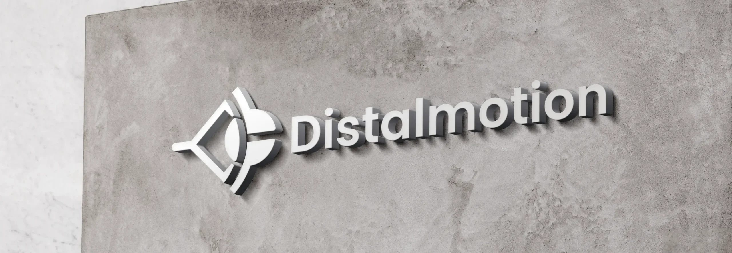
This resulted in our final logo, which gave us a cohesive mark to build out our brand board. From there, I built a custom logo reveal animation in After Effects to showcase the new symbol and set the visual stage for our physical tactics.
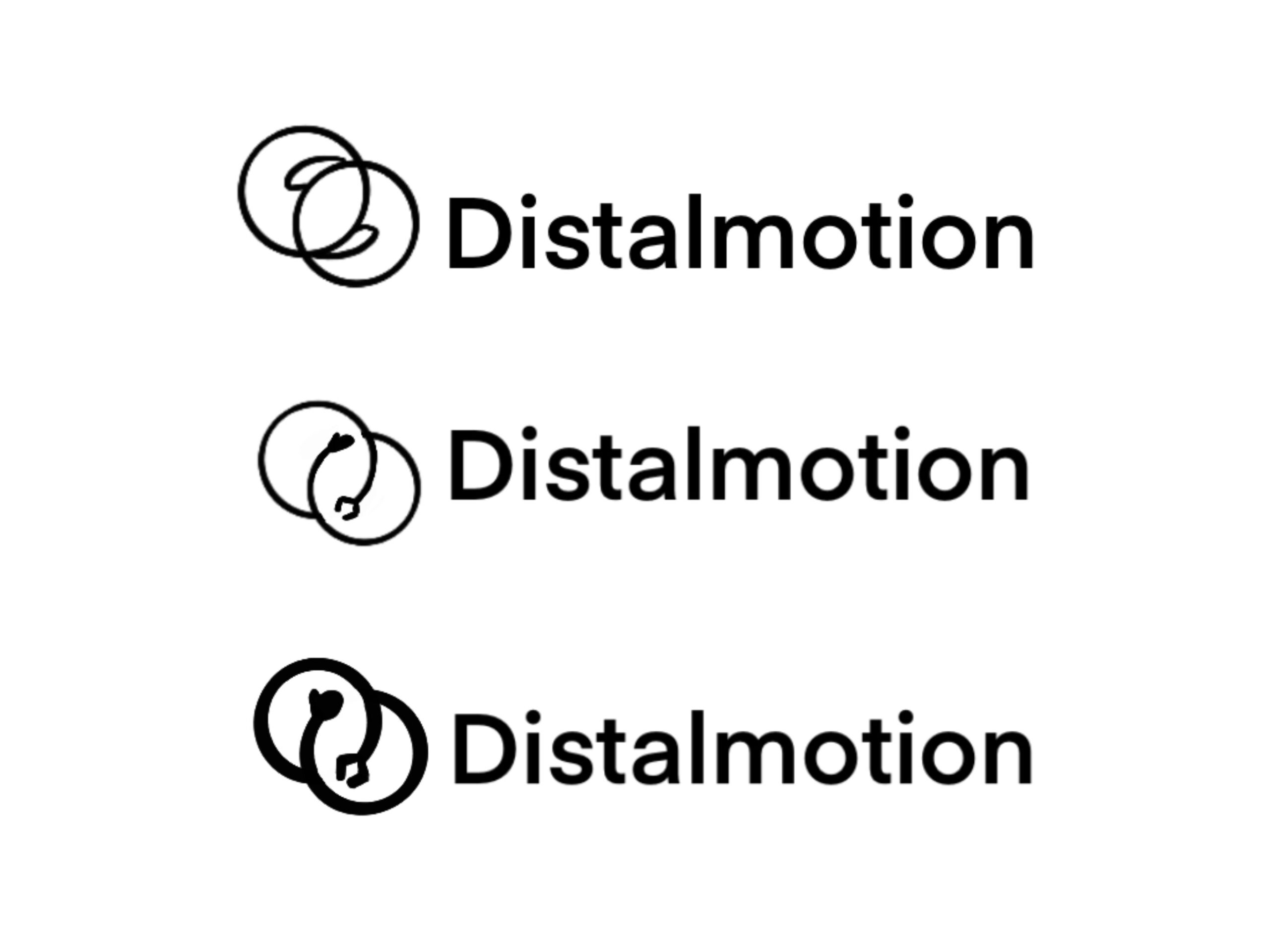
The very initial ideas behind the final logo. You can see the more abstract idea it started with two interlocking circles, showing the two sides of Distalmotions focus, the technology behind Dexter and care for physicians.
Mockup of a more refined version of the initial logo. We wanted to see how it would feel in a real world setting and if it felt like Distalmotion.
As a team we decided the concept became too literal and we wanted to explore more abstract iterations. Here is an in progress look at my logo sketches as I worked through the problem.
Collectively as a team we enjoyed the more subtle nod to two hands connecting, a more angular hand and then a more rounded hand, showing the contrast between tech and human connection. This naturally evolved with two different shapes, a square and circle.
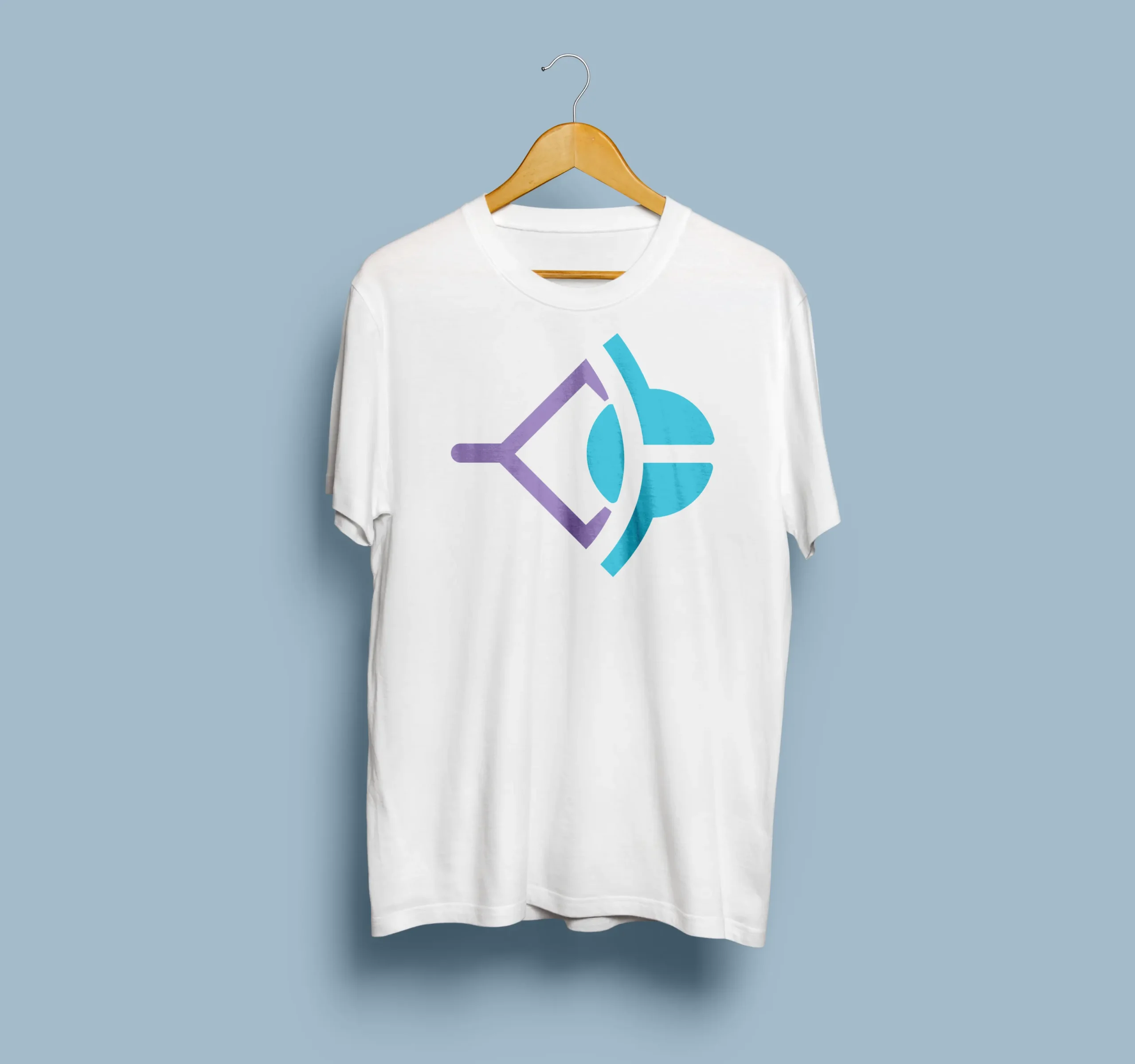
In the final logo mark, we extended the two arms out from the rounded circle to emphasize connection. This highlights how the angular, robotic hand contrasts with the soft, circular shape, creating a clear visual distinction between mechanical precision and empathetic physician care.
Final Logo on a T-Shirt Mockup
Our Brand is
a WIP
ready to go
Our final pitch relied on functional digital touchpoints to show a realistic, twelve-month commercial rollout plan for Dexter. I handled the brunt of the creative labor, translating our marketing team’s business logic into functional layouts within Figma to make our branding feel real.
This hands-on production involved building high-fidelity interface mockups for a digital ROI calculator, a dedicated medical forum, an interactive chatbot, an online community platform, and a B2B webinar series. These assets demonstrated exactly how the visual identity functions across real budgets and digital channels.
Our roadmap of our tactics. Here you can see the journey our target customer would go on and how each tactic would help them in the purchase of a Dexter.
An example of one of our tactic slides. Here we are showing our tactic for medical conferences. We present visual mockups that make the event seem real and present our plan for attending these medical conferences.
The ROI dashboard I created in Figma. Here a customer would be able to go to Distalmotions website and calculate their ROI if they were to purchase Dexter.
Mockup of our Interactive Webinars for teaching physicians about Dexter. Using Gemini AI, I was able to animate a still image and from there add Distalmotions branding to make it feel real.
Finally our community and support tactics. Here physicians would be able to go to Distalmotions website and see what other physicians say about Dexter. Besides this Distalmotion would also offer support for physicians in the means of FAQ questions and a 24/7 support bot that could help potential customers.
a capstone class
to my biggest client project yet
Our team presented the final market analysis, identity system, and rollout tactics directly to Distalmotion CEO Greg Roche. While we did not win the overall competition, our work earned constant praise from our professors and the corporate leadership team.
Even with that positive reception, our logo had evolved into a simpler, more abstract form than what my earlier sketches intended under the tight deadline. I am happy with the logo, our creative strategy, and how cohesive our entire brand is, but I still wish I had more time to sit with the logo and perfect its visual messaging. Overall, working with a real medical robotics company for my capstone was an incredibly challenging and rewarding production experience and I am so thankful for the opportunity to work with Distalmotion.