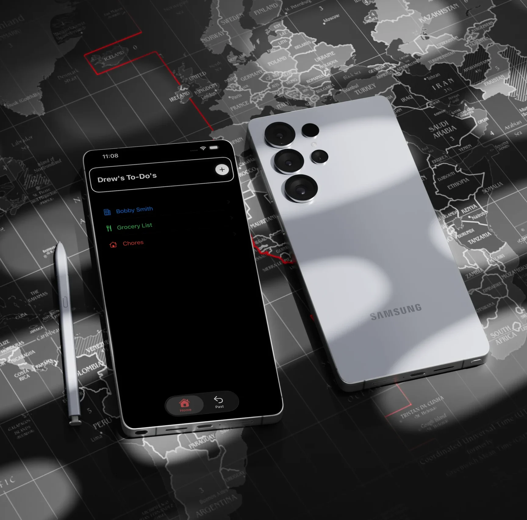
A custom-built task management app designed to bridge the gap between disposable lists and repeatable routines. Developed from scratch in SwiftUI, this app prioritizes a reusable task loop that transforms daily friction into a functional, high-frequency workflow.
objective
Design, develop, and publish a functional iOS application to the Apple App Store learning the SwiftUI framework and Apple’s technical development pipeline.
strategy
Pivot from an over-engineered life-management concept to a streamlined “Home and Past” architecture that allows users to reset and reuse task sets.
outcome
An approved App Store product featuring custom folder iconography, color-coded categorization, and refined UI that supports daily use-case.
For this project I was forced away from comfortable design tools to build directly inside Xcode. I had no prior experience with writing SwiftUI, wrestling with a new coding language instead of just pushing pixels in a mock-up tool.
With these limitations in mind I had a idea, a to-do app. I had some frustration with management apps and knew it was an appropriate challenge for beginner coders, so I got to work.
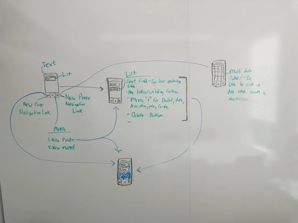
My first idea for making the app. I wanted to make a to-do app that used folders to categorize what you had to do. These items could also be connected to a calender.
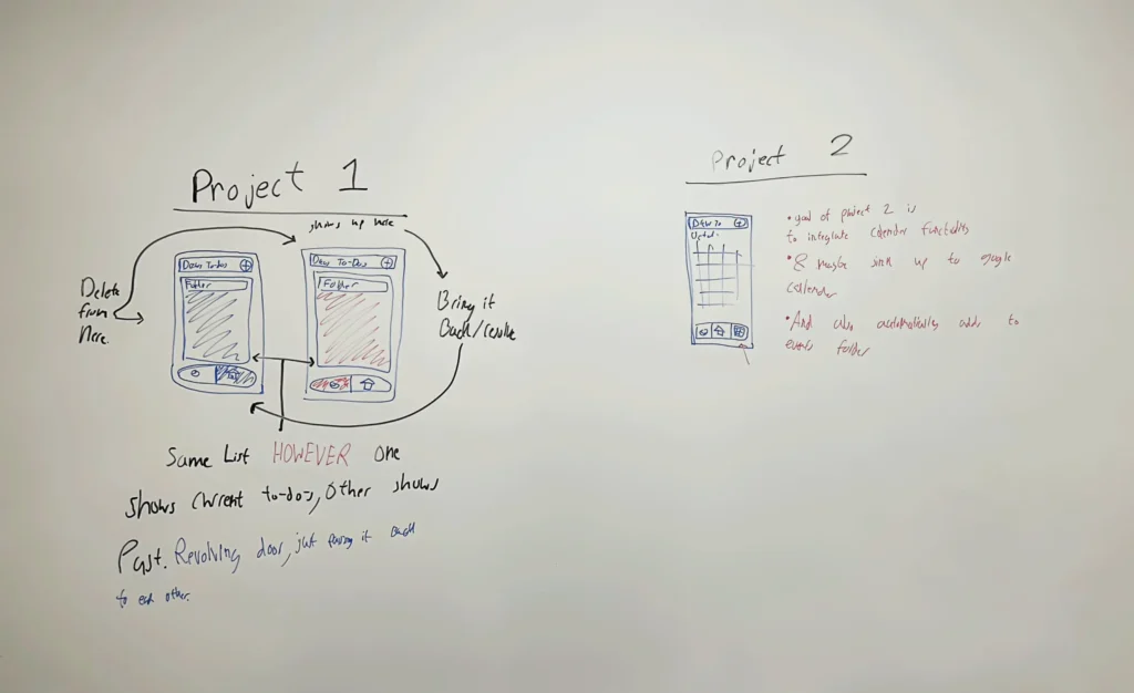
On the left you see the concept for the usage loop. I thought about incorporating the calendar, however it would complicate the simplicity and usability of the app so in the end I got rid of it.
I ended up building the app logic around a specific transition between Home and Past views. Instead of deleting completed tasks, the system moves them to a secondary state where they remain accessible. This creates a functional loop where users reset entire folders, such as a workout routine or a grocery list, with one action.
This simple loop allows for users to check what they had completed in the past while also keeping a cleaner list for current tasks.
I prioritized functional code over aesthetics in the initial builds, spending the early development phase inside Xcode to make the app work in its simplest form. I initially explored a bright, playful primary color palette of red, blue, and green, aiming for a vibrant look. This early stage was also when I planned to include a calendar integration. The goal was to let users connect tasks to a built-in calendar and eventually sync with Google Calendar, but this feature was cut due to the semester time crunch.
Once the core logic was stable, I moved away from the bright primary colors. The system evolved into a minimal layout, replacing generic icons with a custom, high-clarity iconography set and subtle micro-interactions for task completion.
but there was a
problem
solution
The logic for the core user loop was initially broken. Instead of individual tasks moving between views, the code forced entire folders to shift states, which destroyed the utility of the app.
Visually, the app also lacked professional direction. After pivoting away from the primary colors, I tested a warm color scheme using soft oranges and brighter reds. This created a muddled direction. The app was not pleasing to look at, and the palette felt off-putting rather than warm or inviting. Beyond the color issues, the layout felt cluttered and boxy. I stripped away these elements to focus entirely on how users interact with the interface. I replaced the warm palette with a simple black-and-white color scheme that is easier on the eyes, simplifying the layouts to prioritize functionality.
By the semesters end I had finished Drew’s To-Do’s. I was able to fix the main user loop of pushing tasks towards the archive and fix the visual style of the app. Now a cleaner and more straight forward look using the B&W color scheme with a accent of red for the archive. I had finished and published my first ever app.
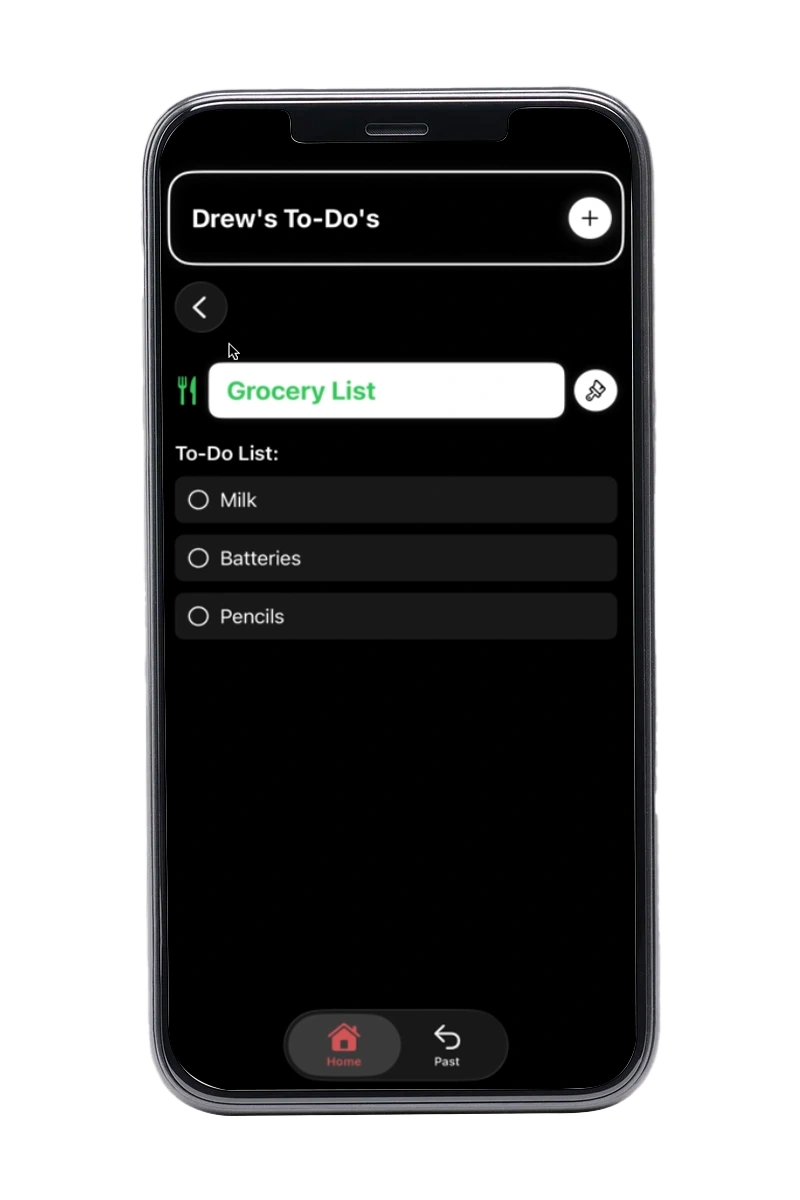
View of the basic folder screen. Here you could add to-dos, text/descriptions, and location.
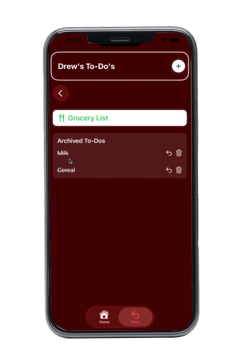
View of the archived screen. Here you would see your past tasks and if you wanted to bring them back.
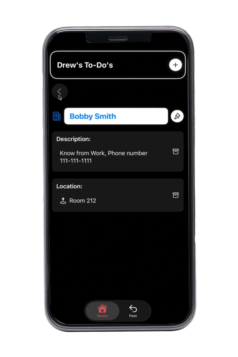
Finally a look at the simple screen with location and description.
From a simple idea
to a app I use everyday
Publishing Drew’s To-Do’s to the App Store was incredibly rewarding. The process of taking an app from initial concept through programming and final deployment to a live store is an amazing feeling.
This project fundamentally changed my approach to development by sharpening my understanding of user flows and significantly improving my core UX design skills and I will always look back on it fondly whenever I open Drew’s To-Do’s.