The U505 is the oldest project in my portfolio, this sophomore year assignment challenged us to choose an existing museum exhibit and redesign its physical and digital touchpoints to improve user flow. As a Chicago native, I chose the U-505 submarine at the Museum of Science and Industry.
I designed a fictional mobile app and an environmental layout focused on localized sub-tours and augmented reality (AR). I keep this project on my site because it was my first time really getting to explore interactive design and how digital tools can naturally enhance a physical space.
objective
Expand the U-505 exhibit by introducing a structured, interactive layer for visitors who want a deeper, step-by-step digital guide through the space.
strategy
Prioritize the user’s physical journey through the exhibit first, identifying key touchpoints around the submarine where digital interactions on a phone could enhance the space.
outcome

Designed a fictional mobile app and website that show how visitors would manage their U505 experience, paired with simple mock-ups illustrating how these elements sit within the space.
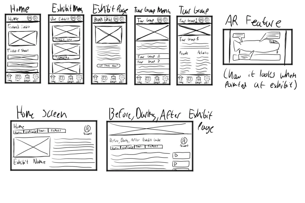
Since this class focused heavily on the technical and structural side of digital products, I started by wireframing the user flow through rough sketches of the home screen and exhibition menus. My goal was to map out exactly how a visitor would navigate the app while walking through the physical exhibit space.
I focused around two core features: the AR scanning capability and the tour management system. This would allow for smaller breakout groups and allow for more accessible information on each users phone.
My initial sketches for planning each screen.
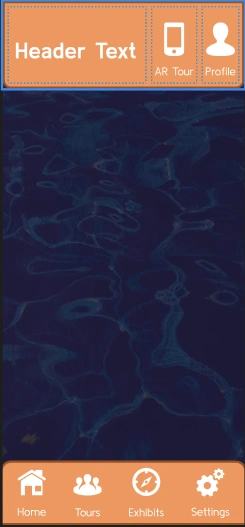
Screenshot of initial color scheme and Figma build. Very rough as I slowly learned Figma.
Refining the color scheme more, I wanted to lean into blue, later removing this brighter pastel blue for a less saturated blue.
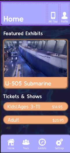
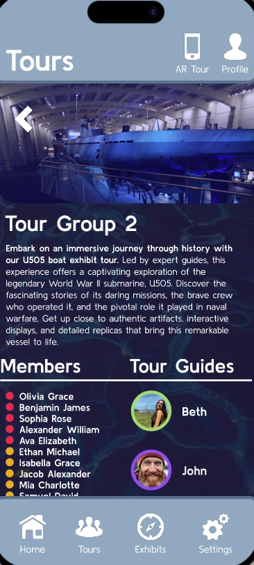
The most updated look of the app, this screen shows you how the tour groups would work.
Since this project was my first time working in Figma, I was learning user interface design while simultaneously trying to learn the software. I focused on leaning into the museum’s existing brand, utilizing deep navy blues and subtle water textures to naturally reinforce the naval theme.
Looking back at these screens now as a graduate, the rookie mistakes are clear, from crowded information blocks to poorly constructed grids. However, it is an honest snapshot of a young designer pushing through the learning curve. Building out multiple exhibit pages helped me understand the mechanics of a digital ecosystem, serving as a critical foundation for how I translate brands across applications today.
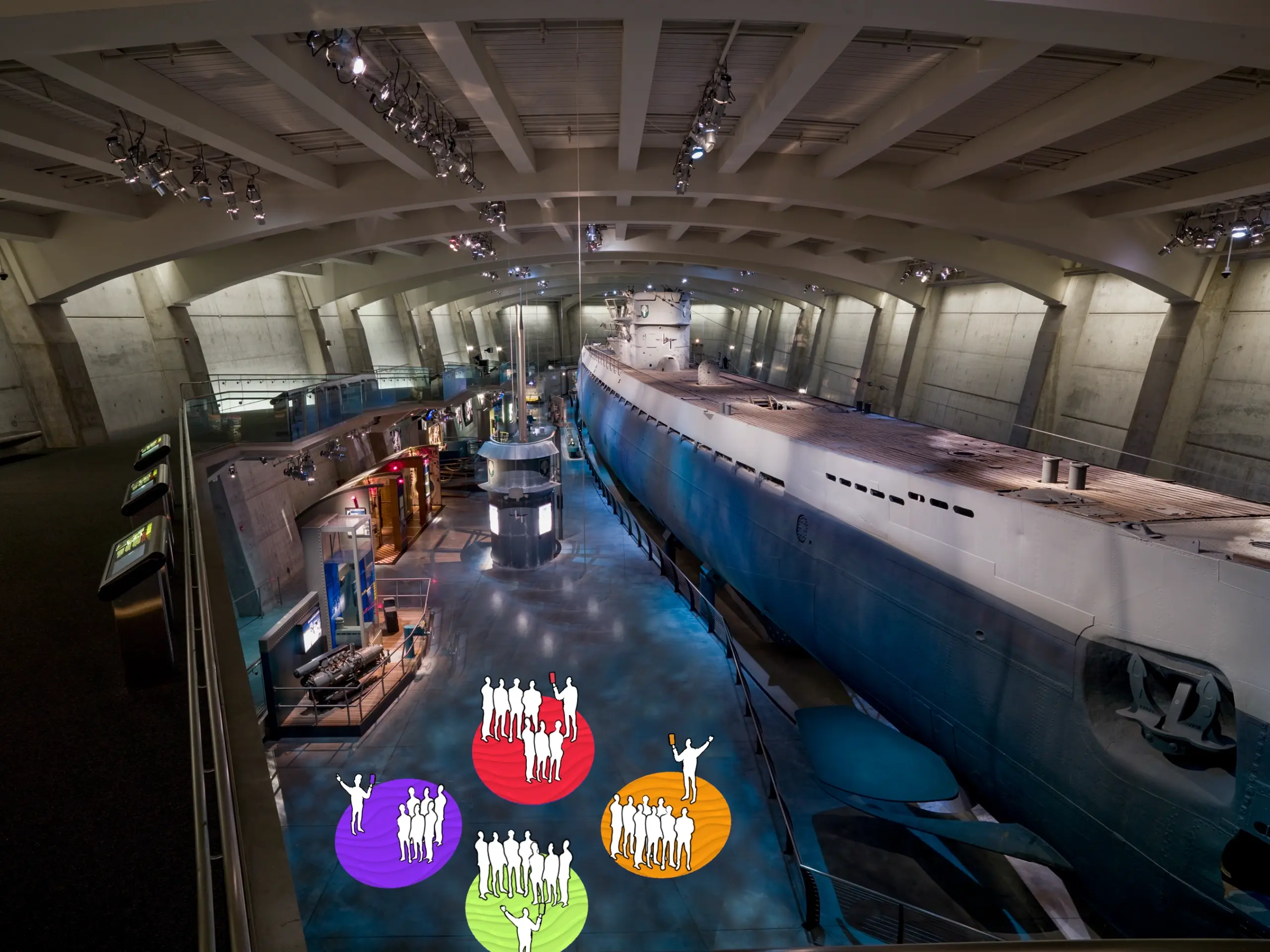
The U505 earned its spot in my portfolio because it focuses heavily on interactive design. I started by mapping out the physical user flow to see how a digital app could pair with the real environment. To create a more personalized experience, the app automatically splits a large tour group into smaller, color-coded subgroups. Each group connects with their own museum staff member for a casual Q&A, which perfectly utilizes the staff MSI already keeps stationed around the exhibit.
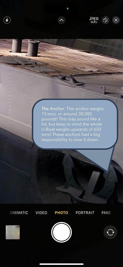
Once visitors are in their groups, the app provides another layer of information through an AR scanning feature. By using Figma’s prototyping tools to simulate live scanning, I built a flow where a user points their phone camera at a specific artifact, like a torpedo, to instantly pull up facts about it.
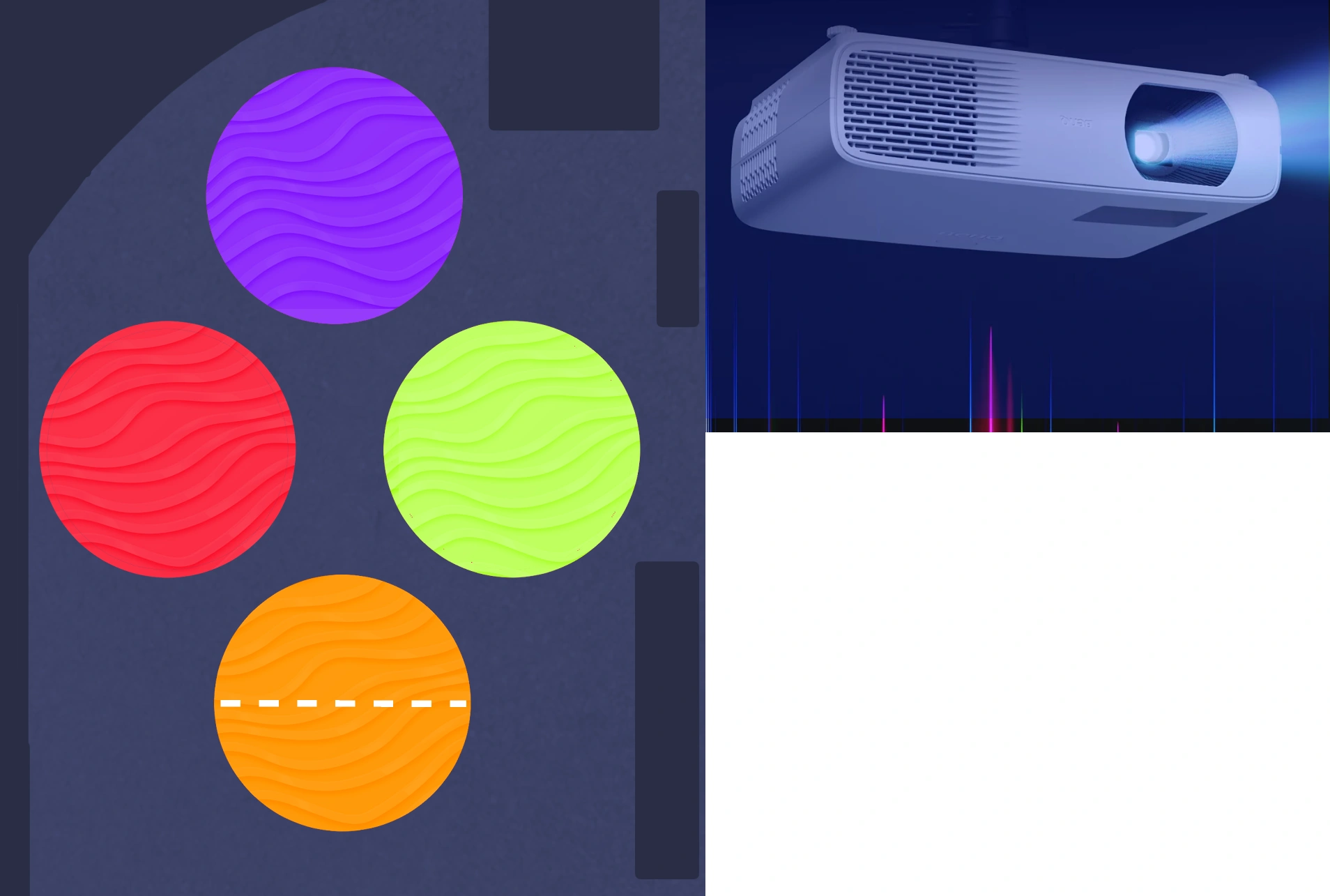
The idea for the physical space. Instead of using physical furniture or a dedicated space for tour groups, instead we would use projectors to project where tour groups would meet.
This visual mockup gives you a idea of where the groups would meet. This is a large open space they have next to the submarine that would have ideal space for walking paths.
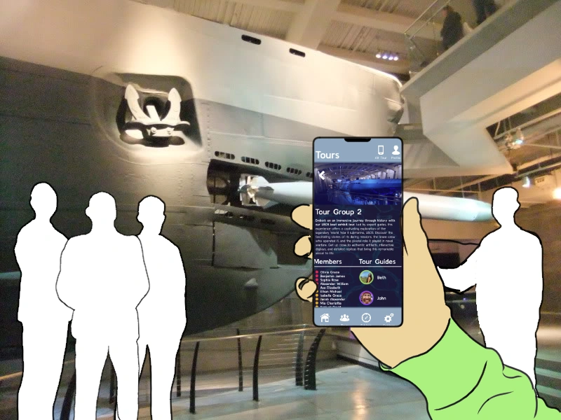
Another visual mockup, this time of one where someone would be in the tour group and their point of view.
A mockup showing how information would appear on the users phone. Using augmented reality, this is how information would appear on users screens.
Lastly I put together a video showing some other potential spots where information could be displayed with AR.
not just app and web design
interactive design that expands upon digital
The final execution brought everything together by establishing a clear connection between the mobile app, the website, and the physical environment. I finalized the interface designs and paired them with simple mock-ups of the exhibit floor to show exactly how the digital tools and physical user flow would align in a real-world space.
The U-505 exhibit redesign was a crucial milestone for my early UX/UI development, serving as my first real introduction to the fundamentals of app and web design. This project introduced me to my love and passion for interactive design, prompting me to consider how digital interfaces pair with a physical, human environment.